Intro
In this article I use the biocLite ComplexHeatmap package in R to visualize patterns found across the entire scope of due diligence exercises conducted on a third party service provider inventory.
Often, when industry professionals talk of concentration risk associated with a supplier inventory we hear people consider how much business is given to a single supplier or how much is serviced out of a specific geographic location. Another less discussed angle on concentration risk is that which emerges from risk acceptance of control gaps. The question is, how much of x risk has been accumulated as an organization because at a micro level, i.e., within business units, certain risk gaps have been tolerated? If in your organization you have a number of business units that each make its risk acceptance decisions in isolation, when you gather the exposures across businesses, legal entities, or regions you may find you have built up exposures. A graphic representation of the due diligence results across every active supplier relationship would allow you to visualize where you may have such issues.
Complex Heatmaps
For the purpose of demonstration, I have created a mock data set that assumes 2000 active supplier relationships and a due diligence program that tests 10 risk dimensions for a total of 20,000 data points. The rating scale used is “Weak”, “Moderate”, “Strong” and if a due diligence exercise was not triggered, it is flagged as “Not Rated”. The data set looks like this:
if(!"ComplexHeatmap" %in% installed.packages()[,"Package"]){
    source("http://bioconductor.org/biocLite.R")
    biocLite("ComplexHeatmap")
}

library(dplyr)
library(ComplexHeatmap)
library(colorRamps)
set.seed(1214)
size <- 1:2000
Test01 <- split(size, sample(rep(1:4, c(1000, 1, 100, 899))))
Test02 <- split(size, sample(rep(1:4, c(100, 150, 1300, 450))))
Test03 <- split(size, sample(rep(1:4, c(300, 50, 200, 1450))))
Test04 <- split(size, sample(rep(1:4, c(500, 10, 100, 1390))))
Test05 <- split(size, sample(rep(1:4, c(250, 5, 50, 1695))))
Test06 <- split(size, sample(rep(1:4, c(700, 1, 10, 1289))))
Test07 <- split(size, sample(rep(1:4, c(75, 5, 120,1800))))
Test08 <- split(size, sample(rep(1:4, c(100, 5, 50, 1845))))
Test09 <- split(size, sample(rep(1:4, c(700, 5, 75, 1220))))
Test10 <- split(size, sample(rep(1:4, c(1600, 5, 195,200))))
levels <- c("Not Rated", "Weak", "Moderate", "Strong")
names(Test01) <- names(Test02) <- names(Test03) <-
names(Test04) <- names(Test05) <- names(Test06) <-
names(Test07) <- names(Test08) <- names(Test09) <-
names(Test10) <- levels
zzTest <- list(Test01, Test02, Test03, Test04, Test05, Test06,
Test07, Test08, Test09, Test10)
sup_list <- tibble(Test01 = NA,
Test02 = NA,
Test03 = NA,
Test04 = NA,
Test05 = NA,
Test06 = NA,
Test07 = NA,
Test08 = NA,
Test09 = NA,
Test10 = NA,
Supplier =paste0("S",seq(1001, 3000, 1)))
for (t in 1:length(zzTest)){
for (name in names(zzTest[[t]])){
sup_list[zzTest[[t]][[name]], t] <- name
}
}
sup_list$Test08[(nrow(sup_list)-100):nrow(sup_list)] <- "Moderate"
sup_list <- sup_list %>%
select(Supplier, everything())
head(sup_list)## # A tibble: 6 x 11
## Supplier Test01 Test02 Test03 Test04 Test05 Test06 Test07 Test08 Test09
## <chr> <chr> <chr> <chr> <chr> <chr> <chr> <chr> <chr> <chr>
## 1 S1001 Strong Moder… Strong Strong Strong Strong Strong Strong Strong
## 2 S1002 Strong Moder… Moder… Strong Strong Strong Not R… Strong Strong
## 3 S1003 Not R… Moder… Strong Not R… Strong Not R… Strong Strong Not R…
## 4 S1004 Strong Moder… Strong Strong Strong Strong Strong Strong Strong
## 5 S1005 Strong Not R… Strong Strong Strong Not R… Strong Strong Strong
## 6 S1006 Strong Moder… Moder… Not R… Strong Strong Strong Strong Not R…
## # … with 1 more variable: Test10 <chr>Here is the heatmap that can be generated from this data.
dm <- as.matrix(sup_list[,2:11])

col_test <- c('Not Rated' = "grey68", Weak = "brown2", Moderate = "gold3",
              Strong = "forestgreen")
alter_fun <- list(
    'Not Rated' = function(x, y, w, h){
        grid.rect(x, y, w-unit(0.5,"mm"), h-unit(0.5, "mm"),
                  gp = gpar(fill = col_test["Not Rated"], col = NA))
    },
    Weak = function(x, y, w, h){
        grid.rect(x, y, w-unit(0.5,"mm"), h-unit(0.5, "mm"),
                  gp = gpar(fill = col_test["Weak"], col = NA))
    },
    Moderate = function(x, y, w, h){
        grid.rect(x, y, w-unit(0.5,"mm"), h-unit(0.5, "mm"),
                  gp = gpar(fill = col_test["Moderate"], col = NA))
    },
    Strong = function(x, y, w, h){
        grid.rect(x, y, w-unit(0.5,"mm"), h-unit(0.5, "mm"),
                  gp = gpar(fill = col_test["Strong"], col = NA))
    }
)

map <- oncoPrint(dm,
                alter_fun = alter_fun, col = col_test, row_order = NULL,
                show_pct = FALSE, column_title = "Due Diligence Conducted",
                heatmap_legend_param = list(title = "Ratings", at = c(levels),
                                            labels = c(levels),
                                            nrow = 1),
                row_title = "Suppliers",
                row_title_side = "left",
                show_column_names = TRUE)

draw(map, heatmap_legend_side = "bottom")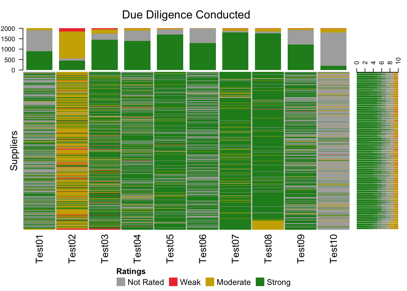
The main part of the heatmap has a row for each of the 2000 suppliers and a column for each of the due diligence tests. Along the top and right side there are graphs of the ratings distributions for each column and row respectively. There are a few patterns in the data that would be worth understanding. Firstly, the case of Test02 is that described above where various micro units of the organization make the same risk acceptance decisions. Test10 highlights a case where the due diligence exercise was rarely triggered. It very well may be the risk is rare, or it could be a sign that the due diligence triggers are not effective. Finally, if we assume that the supplier rows are sorted in chronological order, the sudden appearance of Moderate ratings for Test08 which generally has Strong ratings, suggests something has changed recently leading to a higher level of risk acceptance.
Complex Heatmaps in R can be used to visualize voluminous data sets, such as a large organization’s third party supplier inventory, to identify patterns that may suggest where risk concentrations have emerged.