Intro
A friend had asked how I would approach using a regression model in R on this data set to determine if weather has any impact on Uber usage in New York City. I was intrigued to know the result and thought this would make a good first blog post. A call out to Yannis Pappas for making this dataset available. http://www.yannispappas.com/Exploring-Uber-Demand/
To recap, Yannis compiled the Uber Pickup data from the first 6 months of 2015 (from Kaggle), weather data from the National Centers for Environmental Information, LocationID to Borough mapping (by FiveThirtyEight) and NYC public holidays. He aggregated the data by hour to arrive at 29,101 records.
The 13 variables are as follows: pickup_dt: Time period of the observations. borough: NYC’s borough. pickups: Number of pickups for the period. spd: Wind speed in miles/hour. vsb: Visibility in Miles to nearest tenth. temp: temperature in Fahrenheit. dewp: Dew point in Fahrenheit. slp: Sea level pressure. pcp01: 1-hour liquid precipitation. pcp06: 6-hour liquid precipitation. pcp24: 24-hour liquid precipitation. sd: Snow depth in inches. hday: Being a holiday (Y) or not (N).
We load the required libraries and the uber.csv file.
library(tidyverse)
library(readr)
library(lubridate)
library(caret)
library(corrplot)
library(zoo)
imported_data <- read_csv("uber.csv")
df <- imported_dataIntuitions
I will use the Variable Importance results of a Random Forest to determine the degree to which weather related variables explain variance in Uber pickups.
First, a few intuitions. As I am interested in NYC as a whole, I will consolidate the data over the boroughs. I expect the day of the week adjusted by the holiday variable to be the primary driver of the Uber pickups. My next step will be to create new date component variables and use those variables to generate a baseline model. Then I will look to see to what extent I could improve the model results by introducing weather related variables. My initial thoughts are that rain and snow are the most likely elements that would impact Uber (or taxi for that matter) usage. As for rain, I expect people would not be concerned with previous precipitation, but current state and short term predictions of rain. As for snow, I don’t think people in NYC are that bothered by it when it is coming down, but accumulation could make it harder for those who otherwise were intending to walk. That being said, NYC is pretty efficient at clearing up snow, so likely only accumulation over a recent short time period may prompt people to take an Uber. Based on these initial thoughts, I will work on creating a few new variables from the data.
df <- df %>%
    select(-borough) %>%
    group_by(pickup_dt, hday) %>%
    summarise(pickups = sum(pickups),
              spd = mean(spd),
              vsb = mean(vsb),
              temp = mean(temp),
              dewp = mean(dewp),
              slp = mean(slp),
              pcp01 = mean(pcp01),
              pcp06 = mean(pcp06),
              pcp24 = mean(pcp24),
              sd = mean(sd)) %>%
    ungroup() %>%
    mutate(id = 1:length(unique(df$pickup_dt)),
           month = month(pickup_dt),
           day= day(pickup_dt),
           wday = wday(pickup_dt),
           hour = hour(pickup_dt),
           hday = (hday == "Y"),
           wday_hday = ifelse(hday==TRUE, 8, wday)) %>%
    select(-pickup_dt) %>%
    select(id, everything())
Date Component Variables
Let’s take a look at how these date component variables correlate with the Uber pickups.
correlations <- cor(df[,c("month", "day", "wday_hday", "hour", "pickups")])
corrplot(correlations, order = "hclust")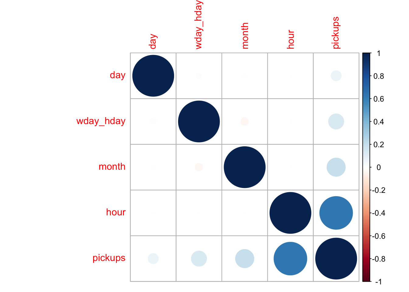
It is no surprise that the hour of the day has a very high correlation to the number of pickups. To a lesser extent we see that the month and day of the week/holiday do as well. Below I explain why I consolidated day of the week and holiday into one variable. The day of the month also correlates positively with the number of pickups but the influence of this variable is negligible.
Let’s take a look at the distribution of pickups over the values of these date variables.
df %>%
    select(month, pickups) %>%
    group_by(month) %>%
    summarise(pickups = mean(pickups)) %>%
    ggplot(aes(month, pickups)) +
    geom_col(fill="lightblue", width = 0.5) +
    labs(title = "Uber Pickups per Month")+
    scale_x_continuous(breaks = 1:6, labels = c("Jan", "Feb", "Mar", "Apr", "May","Jun"))+
    theme_bw()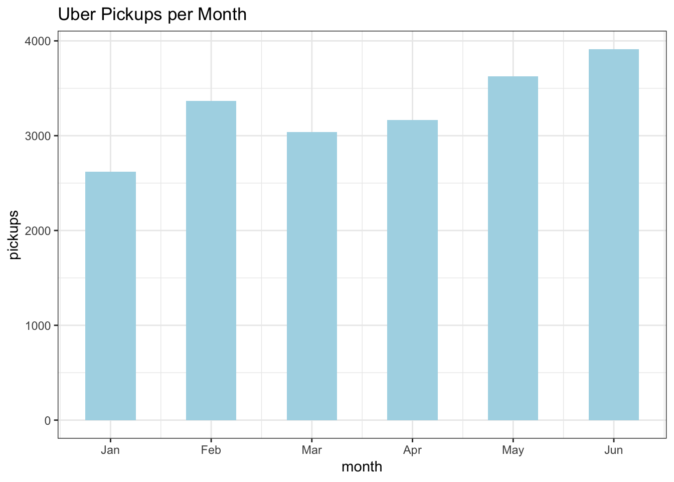
With the exception of February, there is a month on month upward trend in pickups. This trend is likely explained by growing demand and popularity of the service over the course of 2015. It was a year when the number of Uber drivers doubled. https://www.businessinsider.com/uber-doubles-its-drivers-in-2015-2015-10.
df %>%
    select(wday_hday, pickups) %>%
    group_by(wday_hday) %>%
    summarise(pickups = mean(pickups)) %>%
    ggplot(aes(wday_hday, pickups)) +
    geom_col(fill="lightblue", width = 0.5) +
    labs(title = "Uber Pickups per Day of Week / Holiday") +
    scale_x_continuous(breaks = 1:8, labels = c("Sun", "Mon", "Tues", "Wed", "Thu","Fri", "Sat", "Hol"))+
    theme_bw()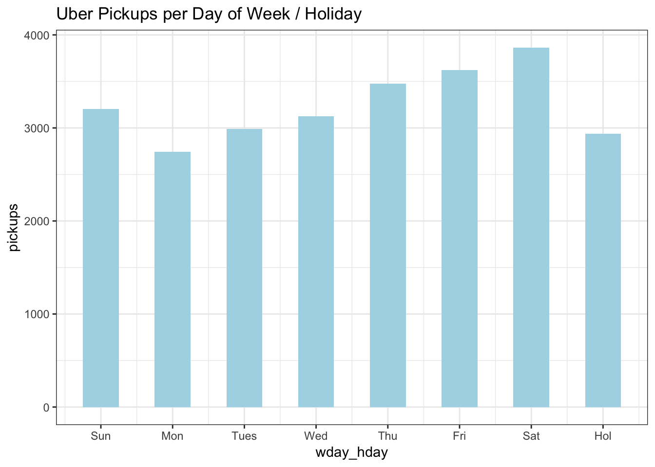
Ridership increases Monday through Saturday then tapers to mid-week levels on Sunday. Holidays had low ridership on a par with Mondays so I overrode the day of the week value if it were a holiday and created an 8th category, giving new meaning to 8 days a week.
df %>%
    select(day, pickups) %>%
    group_by(day) %>%
    summarise(pickups = mean(pickups)) %>%
    ggplot(aes(day, pickups)) +
    geom_col(fill="lightblue") +
    labs(title = "Uber Pickups per Day of the Month") +
    geom_smooth(method='lm',formula= y~ x)+
    theme_bw()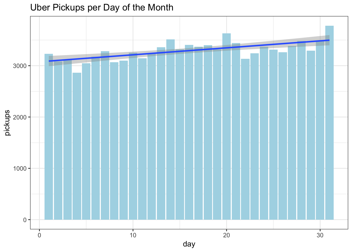
Above when we looked at the correlations, we saw a negligible increase in ridership over the course of the month. One point I found fascinating is that the peaks are around mid-month, the 20th, and the end of the month. A colleague of mine who commuted many years between New Jersey and Westchester, NY had suggested that traffic was worst on those days that correspond with paydays, mid and end of month for those who get paid bi-weekly, and around the 20th for those who get paid monthly. I haven’t found any research that supports that so it may be the subject of a future little project.
df %>%
    select(hour, pickups) %>%
    group_by(hour) %>%
    summarise(pickups = mean(pickups)) %>%
    ggplot(aes(hour, pickups)) +
    geom_col(fill="lightblue") +
    labs(title = "Uber Pickups per Hour")+
    theme_bw()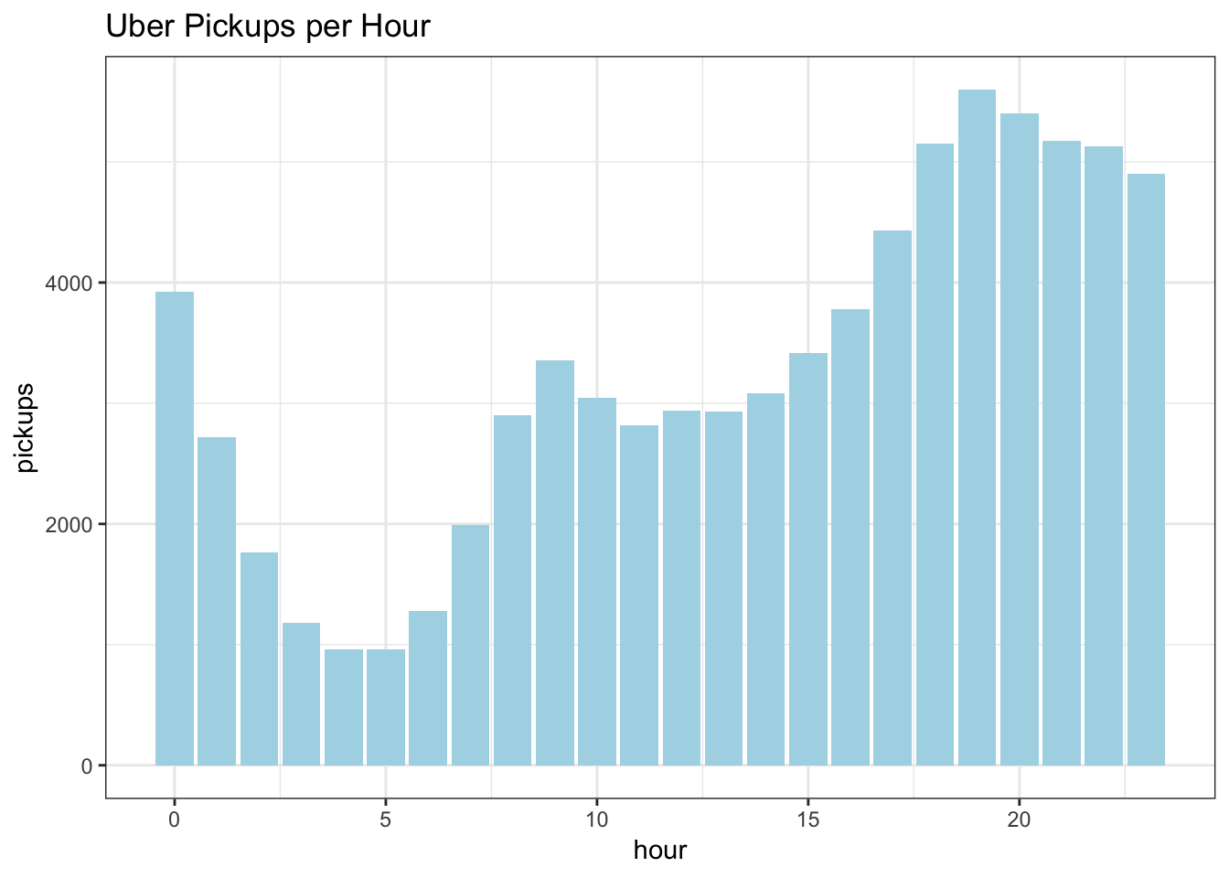
The impact of the Hour variable is quite clear with Uber pickups increasing in the morning rush hour, tapering a bit in the early afternoon, picking up for the evening rush, keeping high throughout the evening, then dropping off in the early morning hours.
Let’s run a model with these variables to see how much of the variance in Uber pickups they explain. Since we are looking to understand the amount of variance explained, we will use RSquared as the metric.
train_x <- df[,c("month", "day", "wday_hday", "hour")]
train_y <- as.numeric(df$pickups)

set.seed(101)
rf <- train(train_x, train_y, method = "rf", metric = "RSquared", importance = TRUE)

v <- (varImp(rf)$importance)
Variable <- as.matrix(rownames(v))
v <- cbind(Variable,v)
v <- head(v[order(-v$Overall),],ncol(train_x))


ggplot(data=v, aes(reorder(Variable, -Overall), y=Overall))+
    geom_bar(stat="identity",fill="red", width = 0.5)+
    theme(axis.text.x=element_text(angle=45,vjust =1, hjust=1))+
    labs(x="Variable", y="Importance")+
    ggtitle(paste0("Variable Importance with ", round(max(rf$finalModel$rsq) * 100, 2)," of variance explained"))+
    theme_bw()+
    theme(axis.text.x = element_text(angle = 45, hjust = 1))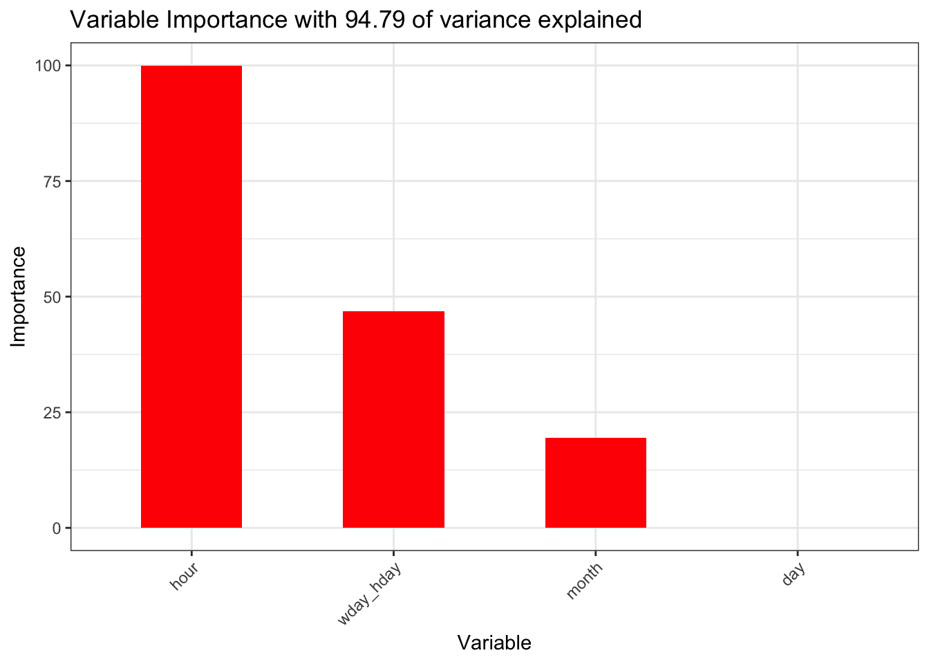
The hour, wday_hday and month variables account for 94.79 of the variance. That is the baseline we now need to see if we can improve upon with the weather related variables.
Weather Component Variables
We will start again by looking at the variable correlations with the target variable and this time also check for high correlations across variables.
correlations <- cor(df[,c("month", "day", "wday_hday", "hour", "pickups","spd", "vsb", "temp",
                          "dewp", "slp", "pcp01", "pcp06", "pcp24", "sd")])
corrplot(correlations, order = "hclust")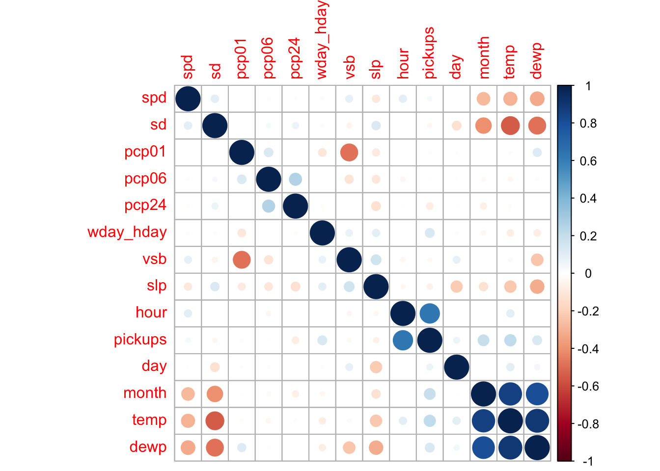
The variable that stands out the most as having a correlation with pickups, a positive correlation, is temperature. Does this suggest that as the weather warms up, more people take Uber? There is a high positive correlation between temperature and month. This is to be expected in the first 6 months of the year as generally temperature increases each of those months. Above, we saw that the number of pickups increased each month and this was due to the increase in the number of Uber drivers. Similarly, the dew point variable is highly dependent on temperature. It is best to ignore the temp and dewp variables because of the correlation with the month variable. Sea level pressure shows a slight negative correlation with pickups and it is usually an indicator of the weather. The pcp24, previous 24 hour liquid precipitation, would also appear to have a slight negative correlation with pickups. It seems counterintuitive that this variable would have any correlation with pickups when the previous 1 and 6 hours do not, let alone a negative correlation. Let’s look more closely at these precipitation variables.
Let’s start by taking a look at snow.
plot(df$id, df$sd,
main="Snow Depth over Sequenced Records",
xlab="Sequence ID",
ylab="Snow Depth")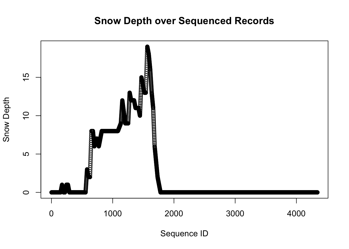
The sd variable measures snow depth. From the graph we can identify periods when the snow is accumulating and periods when it is melting. We will define a new variable to measure the amount of snow fall when the sd value is increasing.
Before we look at the actual precipitation variables, let’s consider the basic pattern we should see when they are plotted. As an example, I’ve made a data set that covers 24 hours and for the first 12 hours the precipitation is a constant 0.01 per hour. There is no precipitation in the latter 12 hours. Will assume there was also no precipitation in the 24 hour period preceeding this data set.
df2 <- data.frame(id = (1:24), pcp01 = c(rep(c(0.1,0), each = 12)))
df2$pcp06 <- rollapply(df2$pcp01, FUN = sum, width = 6, partial= TRUE, align = "right")
df2$pcp24 <- rollapply(df2$pcp01, FUN = sum, width = 24, partial= TRUE, align = "right")

ggplot(df2,aes(id))+
    geom_line(aes(y=pcp01, color="pcp01"), position = position_jitter(w=0.1, h=.004))+
    geom_line(aes(y=pcp06, color="pcp06"), position = position_jitter(w=0.1, h=.003))+
    geom_line(aes(y=pcp24, color="pcp24"), position = position_jitter(w=0.1, h=.005))+
    theme_bw()+
    labs(title = "Anticipated Pattern of Precipitation Tracking Variables",
         x= "Hourly Sequence ID", y = "Precipitation Amount",
         colour = "Variable")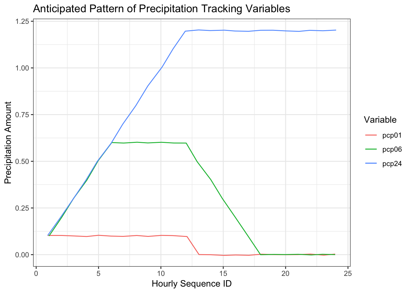
An obvious point in this graph is that the three variables begin to track the accumulated precipitation at the same point in time, in this case, hour 1. At hour 10, the previous one hour precipitation is 0.1, the previous 6 hour precipitation is 0.6, and the previous 24 hour precipitation is 1.0. This pattern, however, is not apparent in the Uber data set which leads me to believe the variables are not tracking what the data specifications say they are.
df %>%
    select(id, pcp01, pcp06, pcp24) %>%
    filter(id %in% (170:220)) %>%
    ggplot(aes(id))+
    geom_line(aes(y=pcp01, color="pcp01"))+
    geom_line(aes(y=pcp06, color="pcp06"))+
    geom_line(aes(y=pcp24, color="pcp24"))+
    theme_bw()+
    labs(title = "Precipitation Variables Hours 170 to 220", x= "Hourly Sequence ID", y = "Precipitation Amount",
         colour = "Variable")+
    geom_point(data = subset(df, id==198), aes(id,pcp24))+
    geom_text(data = subset(df, id==198), aes(id,pcp24,label = id), nudge_y = 0.002)+
    geom_point(data = subset(df, id==204), aes(id,pcp01))+
    geom_text(data = subset(df, id==204), aes(id,pcp01,label = id), nudge_y = 0.002)+
    geom_point(data = subset(df, id==208), aes(id,pcp06))+
    geom_text(data = subset(df, id==208), aes(id,pcp06,label = id), nudge_x = 2,nudge_y = 0.002)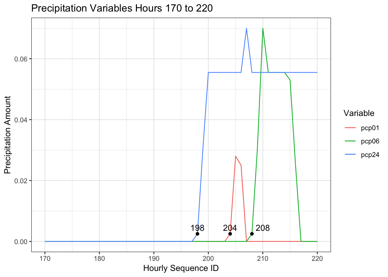
This graph maps the precipitation variables from around Jan 7th, from the 170th to the 220th sequential hour in the data set after a period of more than 24 hours with no liquid precipitation. This sample parallels the hypothetical example I created above to demonstrate how the accumulation variables should work. Contrary to what we saw in the hypothetical example, the three variables are out of synch. I am going to assume that the 1 hour tracking variable is correct and the other two are wrong. Will create two replacement variables based on pcp01.
df$pcp06_replace <- rollapply(df$pcp01, FUN = sum, width = 6, partial= TRUE, align = "right")
df$pcp24_replace <- rollapply(df$pcp01, FUN = sum, width = 24, partial= TRUE, align = "right")

df %>%
    select(id, pcp01, pcp06_replace, pcp24_replace) %>%
    filter(id %in% (170:220)) %>%
    ggplot(aes(id))+
    geom_line(aes(y=pcp01, color="pcp01"), position = position_jitter(w=0.4, h=.0004))+
    geom_line(aes(y=pcp06_replace, color="pcp06_replace"), position = position_jitter(w=0.5, h=.0003))+
    geom_line(aes(y=pcp24_replace, color="pcp24_replace"), position = position_jitter(w=0.3, h=.0005))+
    theme_bw()+
    labs(title = "Revised Precipitation Variables Hours 170 to 220", x= "Hourly Sequence ID", y = "Precipitation Amount",
         colour = "Variable")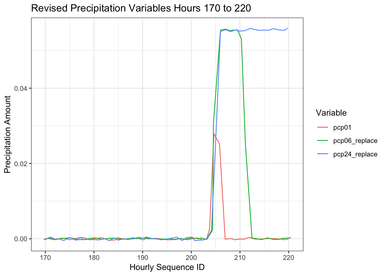
These variables now act as expected though I doubt they will have an impact on Uber pickups. I will show the correlation plot one last time as there are a few other issues that have emerged that reflect the fact the data set is over a relatively short period of time.
correlations <- cor(df[,c("month", "day", "wday_hday", "hour", "pickups","spd", "vsb", "temp",
                          "dewp","slp", "pcp01", "pcp06_replace", "pcp24_replace", "snowfall")])
corrplot(correlations, order = "hclust")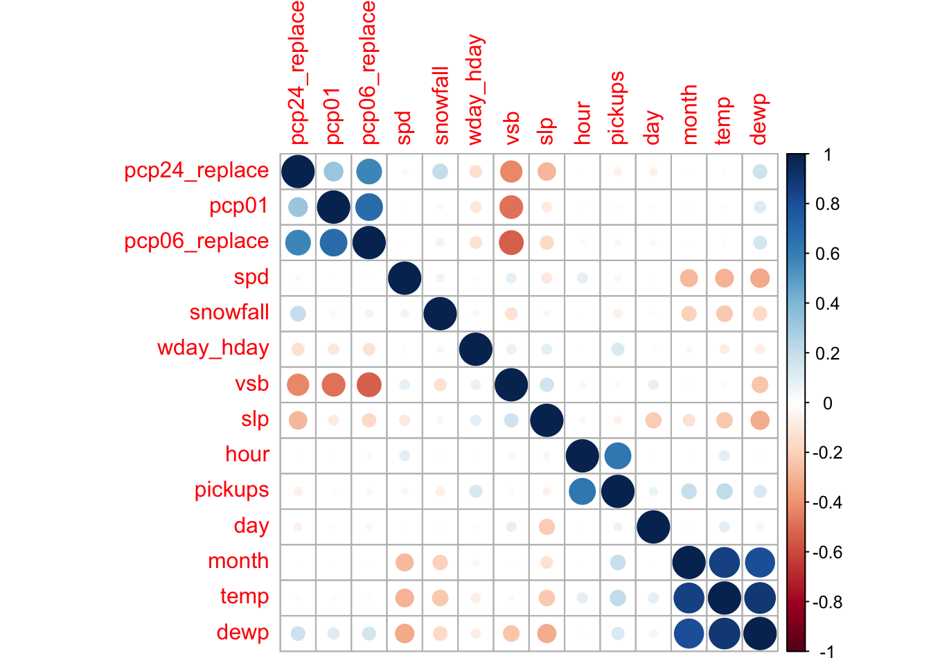
On the positive side, we can see that the relationship between visibility (vsb) and the precipitation variables is stronger which suggests these variables are now more in synch. It is a similar situation with the sea level pressure variable (slp). On the not so positive side, we see minor negative correlations between the precipitation variables and day of the week (wday_hday), and between both sea level pressure (slp) and visibility (vsb), and day of the month (day). If you were to plot the pcp01 variable by the day of the week, you’d see that over this period, more rain tended to fall on the first three days of the week. The plot below between the day of the month and sea level pressure suggests that 6 months of data is not enough to completely randomize the relationship between these variables.
ggplot(df,aes(day, slp))+
    geom_point()+
    geom_smooth() +
    labs(title = "Sea Level Pressure by Day of the Month")
## `geom_smooth()` using method = 'gam' and formula 'y ~ s(x, bs = "cs")'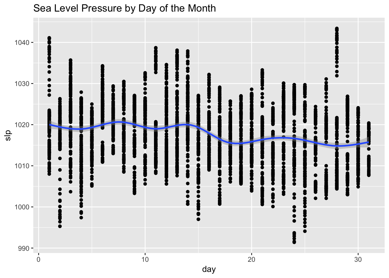
Returning to my initial intuitions, I am going to use the pcp01 and snowfall variables to create two new types of variables. The first set of new variables will capture the last several hours of rain and snowfall. The second set will assume that the rain and snow that actually fell during any given hour was predicted several hours in advance.
df <- df %>%
    mutate(rain_2hr_cum = pcp01 + lag(pcp01, n=1, default = 0)  + lag(pcp01, n=2, default = 0),
           rain_2hr_pred = pcp01 + lead(pcp01, n=1, default = 0)  + lead(pcp01, n=2, default = 0),
           snow_2hr_cum = snowfall + lag(snowfall, n=1, default = 0)  + lag(snowfall, n=2, default = 0),
           snow_2hr_pred = snowfall + lead(snowfall, n=1, default = 0)  + lead(snowfall, n=2, default = 0))
Importance of the Weather Variables
Ultimately, after running a multitude of scenarios that included weather related variables, this is the set that explained the most variance.
train_x <- df[,c("month", "day", "wday_hday", "hour", "rain_2hr_pred", "snow_2hr_cum", "slp")]
train_y <- as.numeric(df$pickups)

set.seed(101)
rf <- train(train_x, train_y, method = "rf", metric = "RSquared", importance = TRUE)

v <- (varImp(rf)$importance)
Variable <- as.matrix(rownames(v))
v <- cbind(Variable,v)
v <- head(v[order(-v$Overall),],ncol(train_x))


ggplot(data=v, aes(reorder(Variable, -Overall), y=Overall))+
    geom_bar(stat="identity",fill="red", width = 0.5)+
    theme(axis.text.x=element_text(angle=45,vjust =1, hjust=1))+
    labs(x="Variable", y="Importance")+
    ggtitle(paste0("Variable Importance with ", round(max(rf$finalModel$rsq) * 100, 2)," of variance explained"))+
    theme_bw()+
    theme(axis.text.x = element_text(angle = 45, hjust = 1))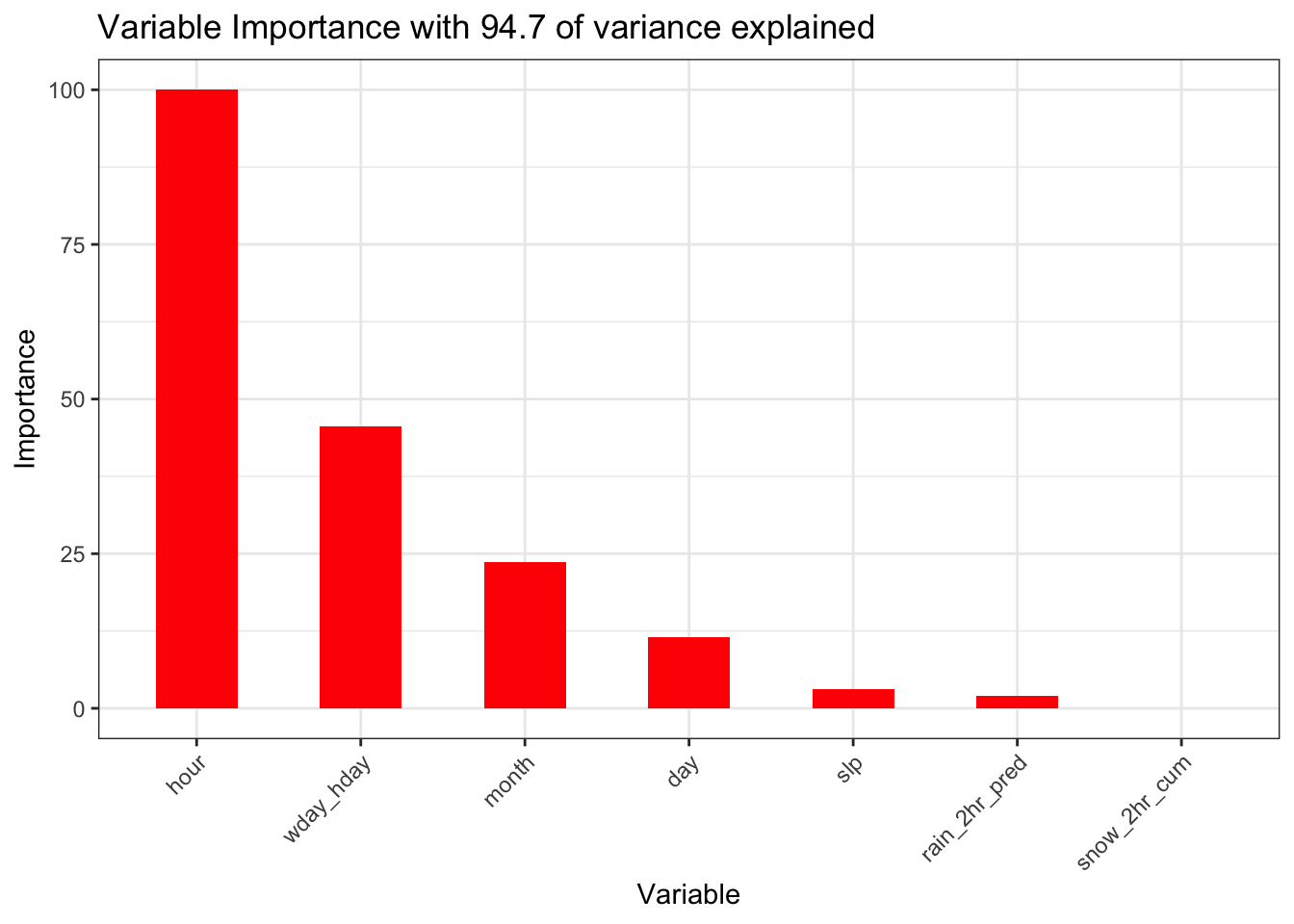
This model with the addition of several weather variables explains nearly the same level of variance as the baseline model though the importance of the weather variables in this model is clearly insignificant. To the extent the weather variables have predictive value, this could be the result of the correlations with the date component variables discussed above. The baseline model is a better model as it explains the same level of variance and is simpler. We thus conclude that weather is not an important factor in determining the number of Uber pickups.