library(tidyverse)
library(readr)
library(ggplot2)
library(igraph)
library(ggraph)
library(viridisLite)
library(RColorBrewer)
imported_data <- read_csv("VendorData.csv")
df <- imported_dataIntro
Visualization is key when you are looking for the story in the data. This holds true particularly for high volume complex data sets, such as the data a firm might compile as part of its supplier risk management program. I am a strong proponent of the use of R for data analytics of this type. Not only is R free, it is easy to learn, has an amazingly helpful and friendly user community, and the visualizations you can make with libraries such as ggplot2 are highly customizable. My favorite stand alone visualization tool is by far Tableau. I was forced to use R when I didn’t have access to Tableau and I learned to make every visualization I had previously made in Tableau in R, and then some. The key thing is that in R, you can integrate your data manipulation and your graphics in one set of code. For example, you can run a predictive model behind your visualiation in R; something you cannot do in Tableau. It is a rare case that you wouldn’t have to prep your data before pulling it into Tableau.
In this article, and a few more that will follow, I intend to demonstrate some visualizations geared toward third party supplier risk management. There are some vexing issues, particularly in the financial services industry within which I work, such as how to identify supply chain risks, or risks across nth suppliers as it is often framed. Here I will introduce network diagrams as a tool to identify hidden dependencies that may warrant more in depth risk analysis.
We start with a truncated version of a mock supplier inventory. Each row represents a single service relationship between a supplier and a specific business unit of the company. The business unit is denoted by B# and the supplier by V#. There are two fields, Sub1 and Sub2, that capture other suppliers to whom the main supplier subcontracts. The criticality of the service is captured on a 1 to 4 scale with 4 being considered business critical and a 1 the least critical. If you look hard enough at this data you may be able to spot some key dependencies, but even with just 10 records on the screen, it is not an easy task. You may have a dozen business units and hundreds, if not thousands of supplier relationships.
rbind(head(df, 5),tail(df,5))## # A tibble: 10 x 6
## ID BU Supplier Sub1 Sub2 Criticality
## <dbl> <chr> <chr> <chr> <chr> <dbl>
## 1 1 B1 V01 V22 V33 1
## 2 2 B1 V02 V23 V12 2
## 3 3 B1 V03 V24 V19 2
## 4 4 B1 V04 V01 V12 4
## 5 5 B1 V05 V14 V30 1
## 6 16 B3 V11 V19 V26 2
## 7 17 B4 V05 V20 V17 1
## 8 18 B4 V04 V01 V12 4
## 9 19 B4 V09 V16 <NA> 2
## 10 20 B4 V07 V01 V12 3The first step in preparing the data for a network diagram is to extract the relationship pairs into a new table. Here we define two types of relationship, Direct which is between a business unit and a supplier, and Subcontract which is between a Direct supplier and another supplier found in the Sub1 or Sub2 fields. For example, the first row would generate three pairs, one Direct pair between B1 and V01, and then two Subcontractor pairs between V01 and V22, and V01 and V33. Such a table that also preserves the criticality based on the associated Direct relationship may look like this:
df01 <- df[,c("Supplier", "BU", "Criticality")]
df01$Type <- "Direct"
names(df01) <- c("from", "to", "Criticality", "Type")

df02 <- df[,c("Sub1", "Supplier", "Criticality")]
df02$Type <- "Subcontract"
names(df02) <- c("from", "to", "Criticality", "Type")

df03 <- df[,c("Sub2", "Supplier", "Criticality")]
df03$Type <- "Subcontract"
names(df03) <- c("from", "to", "Criticality", "Type")

df1 <- rbind(df01, df02, df03)
df1 <- df1[complete.cases(df1),]

rbind(head(df1, 5),tail(df1,5))
## # A tibble: 10 x 4
## from to Criticality Type
## <chr> <chr> <dbl> <chr>
## 1 V01 B1 1 Direct
## 2 V02 B1 2 Direct
## 3 V03 B1 2 Direct
## 4 V04 B1 4 Direct
## 5 V05 B1 1 Direct
## 6 V12 V04 4 Subcontract
## 7 V26 V11 2 Subcontract
## 8 V17 V05 1 Subcontract
## 9 V12 V04 4 Subcontract
## 10 V12 V07 3 SubcontractNote that the “from” and “to” columns denote the direction of the service. Once we have these relationships defined, we can generate the network diagram. First, we will just look at the Direct relationships.
vert1 <- data.frame(unique(df1[df1$Type == "Direct",1]))   #Business
vert2 <- data.frame(unique(df1[df1$Type == "Direct",2]))   #Supplier
names(vert1) <- "vert"
names(vert2) <- "vert"
vert <- unique(rbind(vert1, vert2))

rel <- df1[df1$Type == "Direct",1:3]
names(rel) <- c("from", "to", "Criticality")

g1 <- graph_from_data_frame(rel, vertices = vert)

V(g1)$family <- ifelse(V(g1)$name %in% vert1$vert, "Business Unit", "Vendor")

ggraph(g1, layout = "linear", circular = TRUE) +
    geom_edge_link(aes(alpha = Criticality), edge_width = 2, edge_color = "steelblue") +
    geom_node_point(color = "steelblue", shape = 16, size  = 3) +
    geom_node_text(aes(label = name, color = family), repel = TRUE,
        point.padding = unit(0.2, "lines"), show.legend = FALSE, fontface = "bold") +
    scale_color_brewer(type = "qual", palette = "Dark2") +
    guides(size = FALSE) +
    labs(title = "Network of Vendor Relationships per Business Unit") +
    theme_void() +
    theme(legend.position = "bottom", plot.title = element_text(face = "bold"))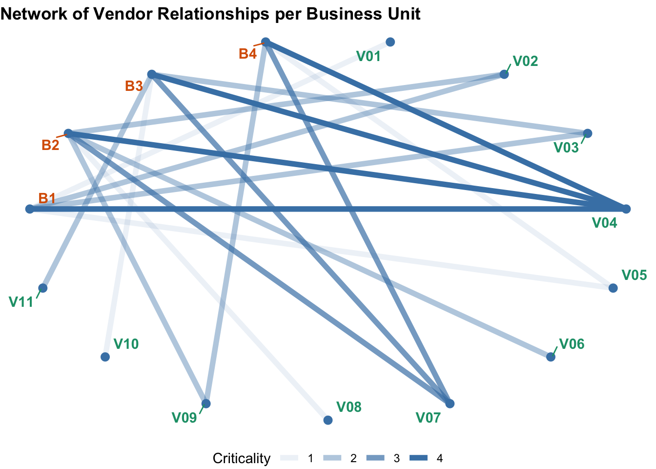
This graphic captures the network of vendor relationships per business unit. The intensity of the line signifies the criticality of the service. There are some vendors that service only one or two of the business units and these would appear to be low criticality. The most critical services would appear to be concentrated across the businesses with Vendor 4, followed by Vendor 7. Often, the level of due diligence applied to the service relationship will be driven by the criticality of the service. We can assume then for the sake of this exercise that the level of due diligence applied to Vendor 1 is low because it directly supports only one business unit for a non-critical service. Next we look at what dependencies may be hidden in the supply chain.
target <- "V01"
set1 <- df1[df1$from == target,]
set2 <- df1[df1$from %in% set1$to,]

dft <-rbind(set1, set2)

vert3 <- data.frame(unique(dft[dft$Type == "Direct",1]))   #Business
vert4 <- data.frame(unique(dft[dft$Type == "Sub",1]))   #Supplier with Subcontractor
vert5 <- data.frame(unique(dft[,2]))   #Supplier/Subcontractor

names(vert3) <- "vert"
names(vert4) <- "vert"
names(vert5) <- "vert"
vertt <- unique(rbind(vert3, vert4, vert5))

relt <- dft[,1:4]
names(relt) <- c("from", "to", "Criticality", "Type")

g2 <- graph_from_data_frame(relt, vertices = vertt)

V(g2)$family <- ifelse(V(g2)$name %in% vert3$vert, "Business Unit", "Vendor")
V(g2)$family[V(g2)$name == target] <- "Target"


ggraph(g2, layout = "linear", circular = TRUE) +
    geom_edge_link(aes(edge_width = Criticality, edge_color = Type)) +
    geom_node_point(color = "steelblue", shape = 16, size  = 5) +
    geom_node_text(aes(label = name, color = family), repel = TRUE,
        point.padding = unit(0.2, "lines"), show.legend = FALSE, fontface = "bold") +
    scale_color_brewer(type = "qual", palette = "Dark2") +
    scale_edge_color_manual(values = c("gold3", "medium purple")) +
    guides(size = FALSE) +
    labs(title = paste0("Network of Vendor Relationships per Business Unit with Dependency on ",target))+
    theme_void() +
    theme(legend.position = "bottom", plot.title = element_text(face = "bold"))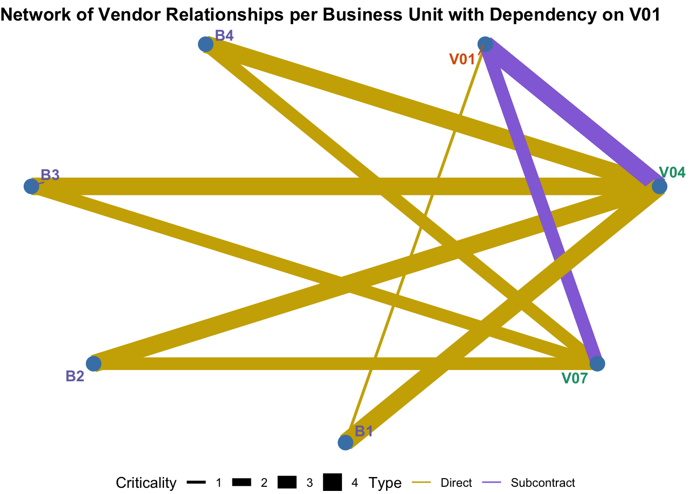
We want to understand where there are subcontractor dependencies in the supply chain. We focus on Vendor 1. First we filter for all direct relationships with Vendor 1, all subcontractor relationships with Vendor 1, and all relationships with those vendors that subcontract to Vendor 1. I’ve changed the graphic up a bit. Now instead of using the line intensity to indicate Criticality, I have used the line thickness. I have color coded the lines to indicate whether the relationship is Direct or Subcontract. Here we can see, as we noted in the earlier graph, there is only one non-critical Direct business unit relationship with Vendor 1. However, now you should also be able to identify that Vendor 4 and Vendor 7 subcontract to Vendor 1 in relation to critical services that impact all or most all of the business units. It is thus apparent that the dependency on Vendor 1 is much greater than understaood if just looking at the direct relationships and suggest that more due diligence on Vendor 1 may be warranted. This same type of analysis can be used to indentify dependencies on vendors where there is no direct relationship at all, or dependencies deeper in the supply chain itself.
Visualizations such as Network Diagrams can help us identify patterns in the data that we may otherwise not notice. In this instance we surface a risk exposure we may otherwise not have anticipated.